Graphic Designing Principles: Explore New Designs in 2025
Graphic Designing Principles
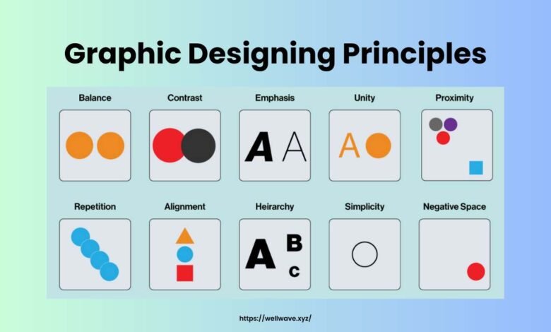
Table of Contents
Graphic designing principles are the backbone to making designs that are attractive and effective. Whether it is a website, poster, or logo, these principles must be understood to be able to do high-quality work that will pass on the intended message to the audience.
Basically, graphic design is visual communication. It can be achieved using typography, color, images, and layout, which all point towards communicating an idea or stirring feelings in a reader.
Importance in Designing
Graphic design principles is the guideline the designer will need to communicate ideas clearly and also engage his or her audience by the presentation and arrangement of the information.
Based on the principle, a designer may use them in formulating unified designs with significant influences towards their desired target.
Use of Contrast Appropriately
This means using various factors such as color, size, and text to make areas that stand out, highlighting critical aspects in a particular design.
Effective Use of Colors
Colors in graphic design represent emotions, inform things, and influence perception. A good understanding of color theory and how to apply colors will prove useful for some effective design concepts.
Color Theory Basics
Color theory refers to the relationship of colors and their interaction with each other. It includes principles such as the color wheel, color harmony, and psychological effects that different colors may create.
Creating Harmonious Palettes
Beautiful color palettes can be created by designers by using complementary or analogous or even monochromatic color schemes, so colors gel well and are thus cohesive in visual design.
Typography and Significance
It is the art and technique of placing stuffs to make readable, attractive, and presentable all written words or language. The proper selection of fonts along with appropriate writing arrangement is required to successfully complete the graphics.
Right Fonts Choice
Every type of font has a different sense and is performing a different meaning. The designer can enhance the tone and style of the design by selecting the right fonts that describe the personality and message of the brand.
Fonts Combinations for Effect
A mix of various fonts allows creating a much-needed visual interest and creating a hierarchy on a page: big, expressive text goes on titles and titles while the general body of information will have much subtler face, providing better contrast and prominence.
Alignment and Consistency
Graphic design has established the alignment and consistency rules meant for the reasons of maintaining visible order and unison on one layout.
This alignment of elements to a grid or a common axis will create a sense of order and organization that will enhance readability and clarity.
Follow Us: Well Wave
Improving Readability and Concentration
With enough white space, designers will avoid visual clutter and let content breathe, allowing the viewer to digest information easily and navigate through the design.
Rule of Thirds
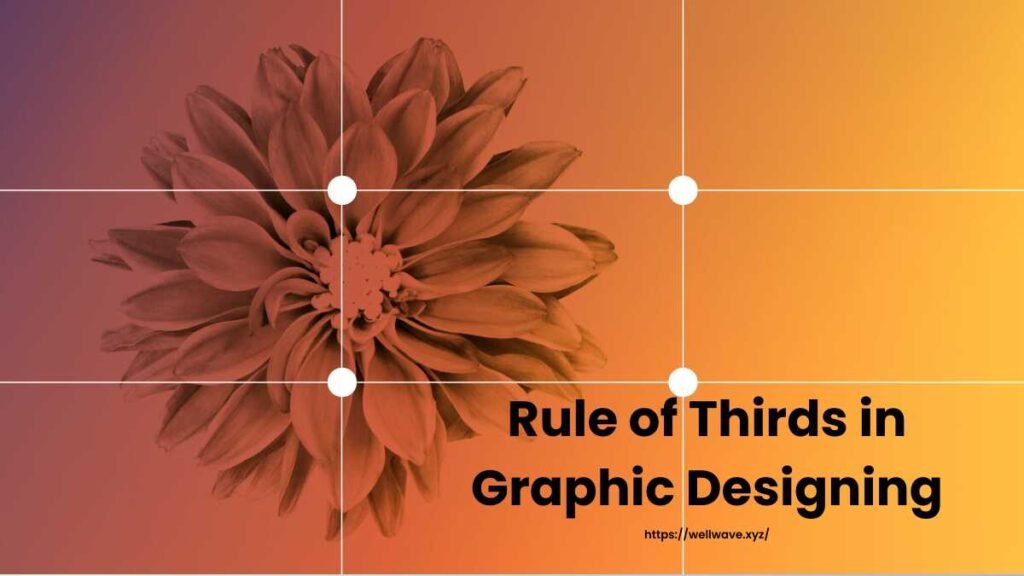
It is a graphic designing principle in which any picture or design is divided into nine equal parts or components by using four lines that are two horizontal and two vertical. Placing important elements on these lines or at their junctions can be used to create balanced and pleasing compositions.
Balancing and Creating Interest
The rule of thirds allows the designer to create a composition that is both visually balanced and interesting: a viewer’s eye is attracted to those areas that are significant within the design.
Simplicity and Minimalism
There are graphic designing principles on simplicity and minimalism which support taking away or deleting unnecessary elements, so only the essentials are achieved in a design. This brings out clarity and elegance in the designs.
Less is More Approach
The more effective and recallable designs will be developed once the clutter and unnecessary decoration is removed, allowing the message to effectively come across.
Knowing Scale and Proportion
Scale and proportion are known as size, but also in relation of the elements in a design. Proper understanding and manipulation of scale and proportion help achieve visual balance and harmony.
Visual Harmony
It provides the composition with visual interest and hierarchy in the sense of guiding the viewer’s eye along the flow that creates balance and harmony.
Reinforcing Design Elements
Through repetition, this reinforces main elements within design, creating rhythm and continuity throughout the piece so that they hang together in coherence.
Emphasis and Focal Points
An emphasis in a design refers to that area or points where the designer wishes to call attention. Establishing emphasis in the design allows one to move the viewer’s eyes and communicates the hierarchy as well as what is important.
Strategic guidance of attention: A designer applies the techniques such as contrast, color, size, and positioning that guide attention while making emphasis to help point attention on key information.
Accessibility in Graphic Design
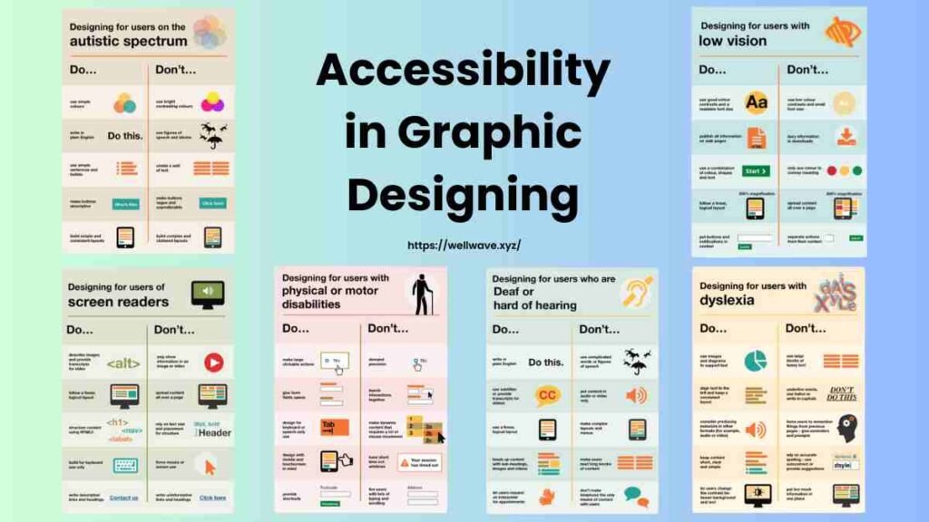
Accessibility in graphic design refers to the design process as one that ensures usability and comprehension of the same designs by persons with different capabilities.
Designing for All
Considering issues like contrast between colors, readable fonts, and navigation clarity, a designer will have achieved an accessible design to everyone: including the differently abled users.
Conclusion
Put very bluntly, graphic designing principles outline some of the most basic tenets that guide and enhance and, by extension, make more beautiful and effective designs. Thereby, a designer would be in the right position to deliver vivid communication as well as grasp the attention of the viewers that would linger on for a while in the minds.
Frequently Asked Questions
Do you know principles of graphic designing?
Graphic designing principles are the guiding principles that assist designers in producing visually appealing and effective designs through proper organization and presentation of information.
Why are principles of graphic designing important?
Graphic designing principles are essential because they provide the basis on which a designer designs. It ensures the designed will communicate effectively to the target audience. Therefore, the outcome is more effective and memorable.
What is contrast in graphic designing?
Contrast is an essential element of graphic design because it helps to create visual interest, a hierarchy, and emphasis by leading the viewer’s eye to identify key information within a piece of design.
How can I make sure that my designs are accessible to all users?
Ensure that all your designs are accessible to the users by taking into consideration things like color contrast, legibility of the font, and simplicity in navigation and then test your designs with a wide audience including people with disabilities.
Read More: Best B2B Lead Generation Tools